Blog > Short Lived Mac Touchbar
Short Lived Mac Touchbar
The Mac used to have a touchbar, somewhat useful, but it's gone now
1,226 words, ~ 6 min read
hardware
perspective
I recently got a 2019 Macbook Pro, 16" for work.
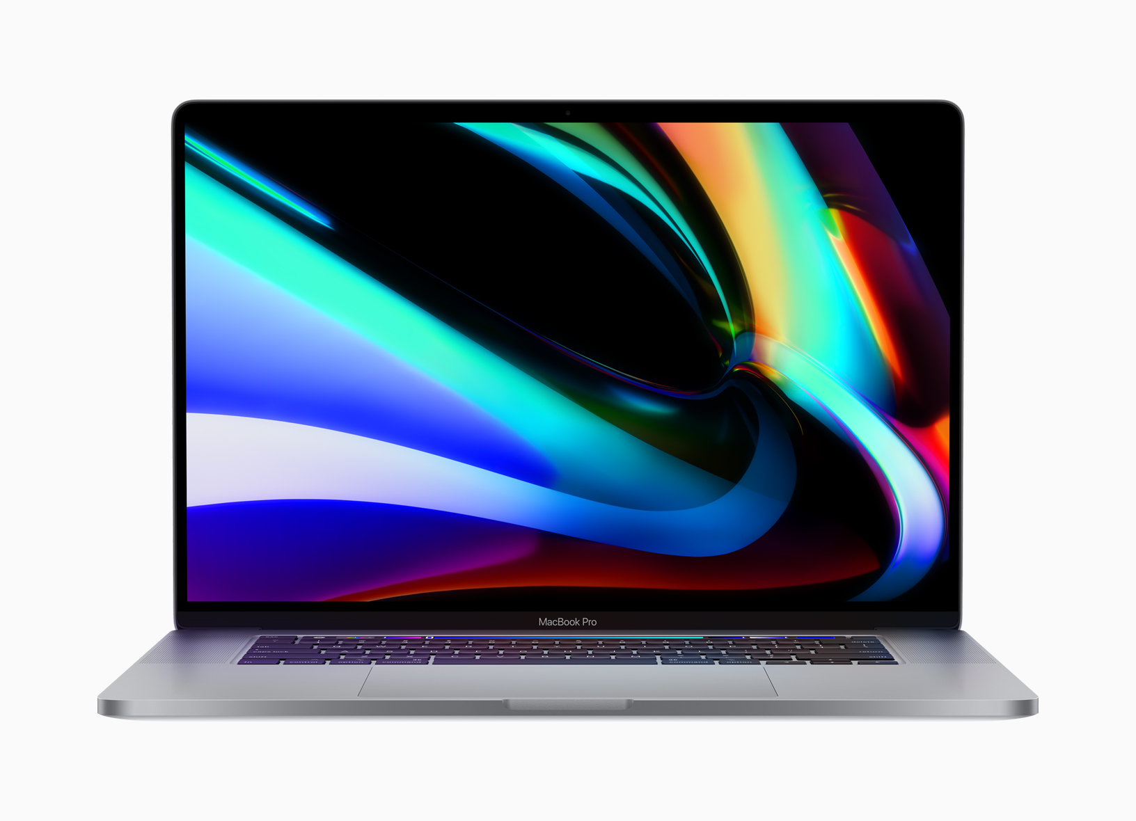
In the past, I've used the M1 Max Macbook Pro, 16" and the 2017 Macbook Pro, 15", with the former not having a touchbar and the latter having one.
I was pretty used to using the M1, with a physical set of keys in the top function row. As of late, I've found that the touchbar is actually somewhat useful in some cases. Apple, however, ultimately removed the touchbar in favor of physical keys. That's something that was widely supported, but I think it bears looking into.
Note that the 2019 model has scissor, not butterfly switches (like the 2017 one); there's some degree of travel, though still not as much as I would prefer.
Table of Contents
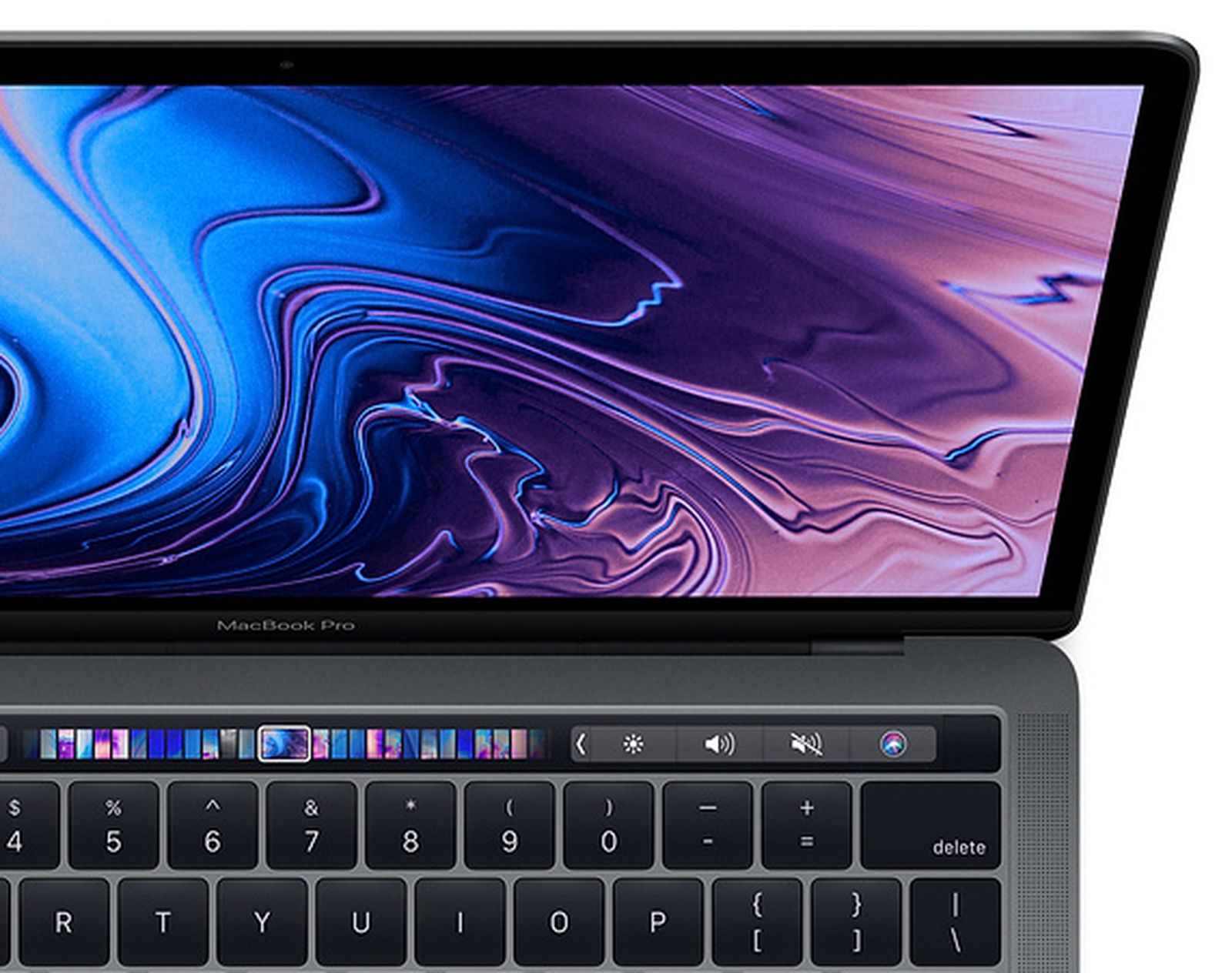
Utility
This particular model had a physical escape key and a physical touch ID sensor with the touch bar in the middle. The gap between the touch bar and the physical sensor makes it easy to sign in, since only fingerprint or password are accepted for login (no Windows Hello).
Audio/Video Playback
Anytime audio was playing, the touchbar would display an icon with the corresponding application. The user can then precisely scroll to where they wanted the music to be, along with buttons to skip, pause, and rewind music.
The level of precision offered by a scrollable touchbar is near impossible to do with physical keys. However, for applications that may benefit from that degree of control, it's possible to implement something similar using a mouse wheel.
Once I got used to scrolling with my finger, switching back to using a mouse and clicking became quite cumbersome. I'm sure I'll adjust, but it felt to be a very natural extension of the touchbar.
App Functionality
Some applications integrate with the touchbar quite well. The previous section on audio/video playback was in the context of apps like Spotify and Apple Music.
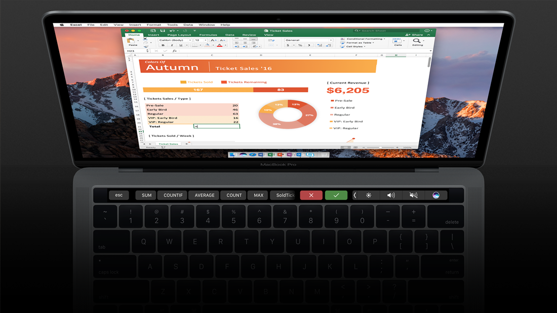
Microsoft Teams, for example, offers different buttons given based on whether the user is in a call. The entire Microsoft Office Suite supports the Touch Bar, with applications frequently showing often-used commands and icons.
VS Code does a particularly good job with this, specifically for the debug mode. When working with larger code files, it's often quite useful to go into debug mode, pause at some line, and inspect the values of all variables in scope at that moment, instead of doing a million print statements.
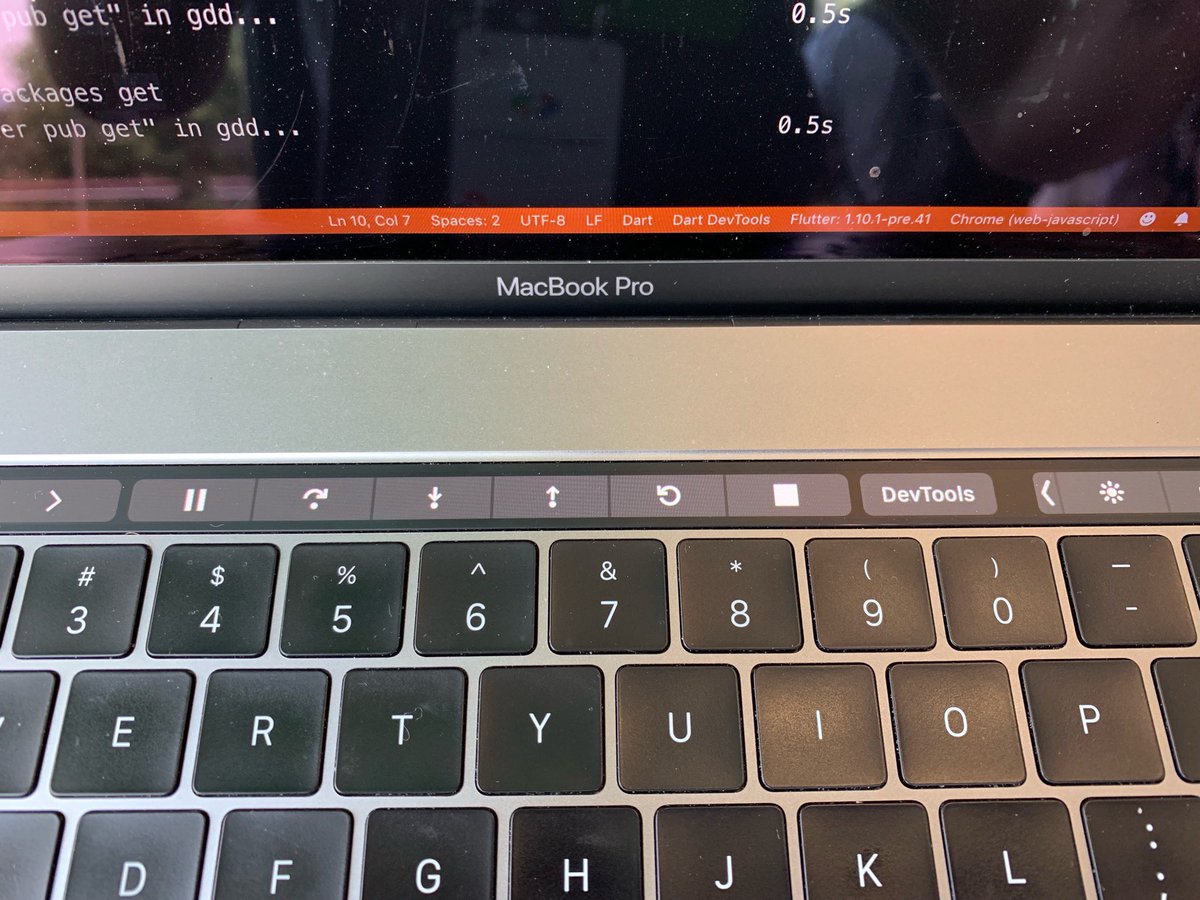
There's numerous options for controlling what is being executed, such as going to the next line of code, stepping into a function call, playing until the next breakpoint, etc. that all go to the touchbar for easy control.
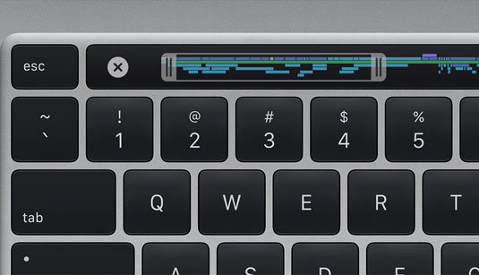
Control Strip
At all times, even if the currently active app is unsupported, there is an option to show a control strip in the right portion of the touch bar. It's customizable, and can be expanded to show more controls such as mission control, backlight brightness, etc. It can also be switched to become function keys or to control different desktop spaces (and projection mode if there is an external display connected).
My favorite feature is the process of adjusting these controls - it becomes a swipe. On the brightness button, if you swipe right, the brightness increases; if you swipe left, it decreases. The same holds true for sound.
From a pragmatic perspective, this makes a lot of sense. There is one control for brightness, that you interact with as you think about it while it takes up less real estate compared to other function and special keys with one key dedicated for an increase and another dedicated for a decrease.
Autocomplete
When typing, the touchbar has an option to suggest words that can be tapped on (similar to iOS autocomplete features). However, it's quite bad, for a number of reasons.
First, it's very slow. I type at a moderate pace (anywhere between 80 to 110 wpm) and it will sometimes remain blank as finding a suggestion for a word is useless given I'm a few words after it.
Second, it's not convenient. When people are typing, their hands are largely in the home row. Selecting an autocomplete word means looking away from the screen to find a suggestion, reaching one hand away from the keyboard, and then choosing that choice. Unless the word was quite long, it's faster to just type it.
Third, there's already a better feature for this - the tab button/the right arrow key. While these are used to switch between things and indent in some software, it can also be used for autocomplete. GitHub Copilot, for example, will suggest text in a faded gray font, with the tab key used to "accept" the autocomplete. Warp, a terminal for MacOS, will have suggestions selected using the right arrow key.
Physical Software
The touchbar is an example of hardware that is able to change dynamically based on software, a powerful concept. Shipping hardware that is designed for one purpose and one purpose only is very limiting; hardware that can take on multiple roles through software is expansive.
Some things are not possible to include in a hardware keyboard, such as emoji controls, music sliding, image selection, autocomplete suggestions (viewable on the keyboard, not screen), etc. These may not be important enough in this given use case, since the display screen will be better compared to the touchbar.
Removal
There are already numerous theories on why Apple has removed the touchbar.
Here's my perspective - it just didn't catch on the way it needed to.
This reminds me a lot of the Windows phone.
Microsoft had a dominating operating system, Windows, and a lot of software to go with it - Microsoft Office, for example. To break into the foray of phones, they decided to venture into building their own operating system, a new competitor to iOS and Android.
The key failure was not the actual product. Many people enjoyed using the Windows Phone, as it was smooth and quite solid. The main issue was the lack of support from external entities. Many apps remained supported only on iOS and Android. Microsoft assumed that many people would be porting applications over, but this was largely not the case. There are some exceptions, of course, like Gameloft (the Asphalt racing games are playable on nearly every device, including the Apple TV using the remote as a controller).
Where this differs from the Windows phone is the need for this feature. The touchbar, despite everything I listed above, simply wasn't worth the effort and made too minimal of an impact for people to be effective.
While the Macbook no longer has this feature, other computers are trying out similar concepts such as the XPS 13 capacitive touchbar, multiple screens on the ASUS ZenBook Pro Duo, and the ASUS NumberPad.
A resurgence of the touchbar may be in the future.
Found this interesting? Subscribe to get email updates for new posts.
First Name
Last Name
Previous Post
Designing Blog Infrastructure, Part 1Next Post
Dolly, No Diddle Daddle